Here is a quick ggplot2 tutorial from Isomorphismes from which I've completed the plots below
These two lines of code produce the same plot but show the differences between qplot and ggplot.
> qplot(clarity, data=diamonds, fill=cut, geom="bar")
> ggplot(diamonds, aes(clarity, fill=cut)) + geom_bar()
Data displayed with a continuous scale (top) and discrete scale (bottom)
> qplot(wt, mpg, data=mtcars, colour=cyl)
> qplot(wt, mpg, data=mtcars, colour=factor(cyl))
>qplot(wt, mpg, data=mtcars, shape=factor(cyl))
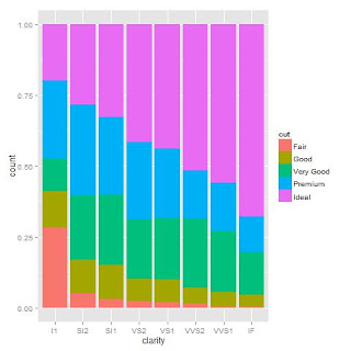
Dodge is probably better for comparing data but lets face it fill is prettier
> qplot(clarity, data=diamonds, geom="bar", fill=cut, position="dodge")
>qplot(clarity, data=diamonds, geom="bar", fill=cut, position="fill")
Not with this data but this is the great plot to use for comparing over a time series.
> qplot(clarity, data=diamonds, geom="freqpoly", group=cut, colour=cut, position="identity")
Changed this one to get better smoothers. More info on that here.
> qplot(wt, mpg, data=mtcars, colour=factor(cyl), geom=c("smooth", "point"), method=glm)
When dealing with lots of data points overplotting is a common problem as you can see from the first plot above.
> t.df <- data.frame(x=rnorm(4000), y=rnorm(4000))
> p.norm <- ggplot(t.df, aes(x,y))
> p.norm + geom_point()
There are 3 easy ways to deal with it. Make the points more transparent. Reduce the size of the points. Make the points hollow.
> p.norm + geom_point(alpha=.15)
> p.norm + geom_point(shape=".")
> p.norm + geom_point(shape=1)
This is also helpful for saving plots
> jpeg('rplot.jpg')
> plot(x,y)
> dev.off()
#Don't forget to turn it back on again
> dev.new()


